How did they make that?
Inspired by the Book review Ulysses by Numbers by Eric Bulson, I have created a visualization of a sentiment analysis of the novel Ulysses. The visualization can be found here. The code for the analysis and the viz plotting is here.
This visualization plots the words based on the frequency (X axis), and shows the top positive and negative words in a sidebar table with related characteristics (adjectives). The Y axis displays a score computed based on the sentiment categories (‘Positive’ and ‘Negative’).
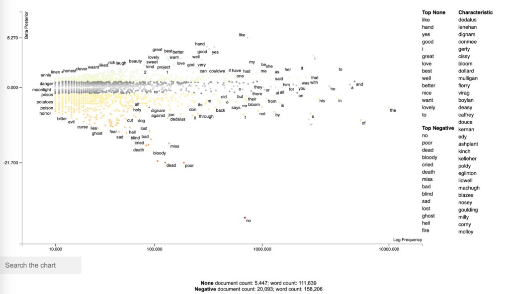
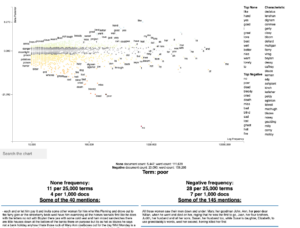
The visualization is interactive, allowing us to search specific words, and retrieve the part of the text where the word occurs.
This HDTMT is intended to show how to run this analysis, and it’s divided into 5 sections, as follows:
- Downloading and importing Ulysses data
- Tokenizing data into sentences
- Perform sentiment analysis
- Plotting the visualization with scattertext
- Deploying the html into github pages
- Next steps and improvements
Downloading and importing Ulysses data
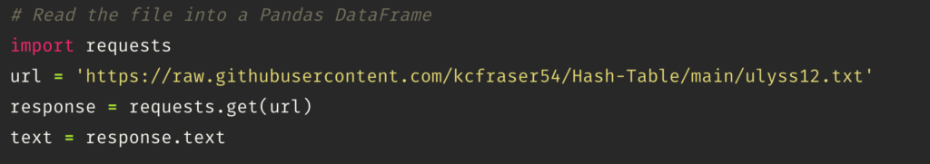
We start by importing “Requests”, the Python library that makes HTTP requests and will connect us to the Github repo where the Ulysses data is stored – here. The data comes from the Gutenberg EBook from August 1, 2008 [EBook #4300], updated on October 30, 2018.
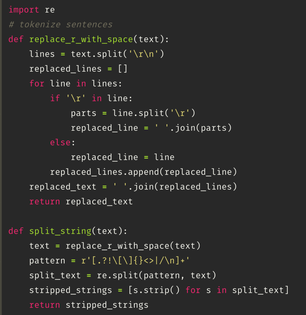
Tokenizing data into sentences
After importing the data, the next step involves cleaning and tokenizing the text into sentences. The data might contain noise such as line breaks (‘\n’) and misplaced line breaks (‘\r’). The function first joins the sentences with misplaced line breaks (‘\r’) to ensure they are connected properly. Then, it tokenizes the text into sentences by splitting the string using ‘\n’, line breaks, and punctuation marks as delimiters. This process ensures that the text is properly segmented into individual sentences for further analysis.
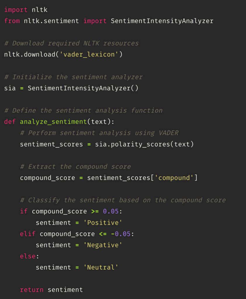
Perform sentiment analysis
The next step is performing a sentiment analysis that classifies the text into positive, negative, and neutral tone. This task is performed using the class SentimentIntensityAnalyzer from the nltk.sentiment module in NLTK (Natural Language Toolkit).
The SentimentIntensityAnalyzer uses a lexicon-based approach to analyze the sentiment of text by calculating a compound score. The compound score is an aggregated sentiment score that combines the positive, negative, and neutral scores. The compound score ranges from -1 (extremely negative) to 1 (extremely positive). If the polarity is greater than 0.05 it can be considered positive; lower than 0.05 is negative, and the values in between are neutral.
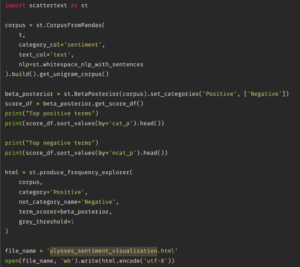
Plotting the visualization with scattertext
The next step is to import scattertext, a Python library that analyzes and creates an html file. The library receives a specific data type, which is a corpus that is created by using the CorpusFromPandas function. This takes a Pandas DataFrame (t) as input and specifies the category column (‘sentiment’) and text column (‘text’). The whitespace_nlp_with_sentences tokenizer is used for text processing. The corpus is then built, and the unigram corpus is extracted from it.
Then, it creates a BetaPosterior from the corpus to compute term scores based on the sentiment categories (‘Positive’ and ‘Negative’). Next, the get_score_df() method is called to get a DataFrame with the scores. The top positive and negative terms are printed based on the ‘cat_p’ (category posterior) and ‘ncat_p’ (non-category posterior) scores, respectively.
The produce_frequency_explorer function generates an interactive HTML visualization of the corpus. It specifies the corpus, the positive category, the name for the negative category, and the term_scorer as the BetaPosterior object. The grey_threshold parameter sets a threshold for terms to be displayed in gray if they have a score below it.
Finally, the resulting HTML visualization is saved to a file named ‘ulysses_sentiment_visualization.html’ using the open function.
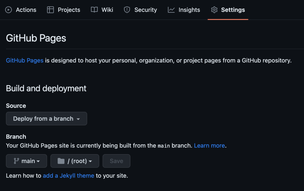
Deploying the html into Github pages
Lastly, we can deploy the html output from the scattertext visualization into a github page. We start by creating a Github repo. Then, uploading the html. Finally, going to settings and changing the deployment source – I’m using from branch, and main/ root in this case.
I’m pointing my Github pages into my alias, livia.work, but you can also use the Github service. This tutorial by professor Ellie Frymire has more details about how to perform the deployment step that can be helpful – here.